Color psychology holds considerable sway in shaping your business image, influencing emotions, productivity, brand perception, and customer behavior. It may be easier to decide if a white power suit or a black one will have the best effect when you’re picking your attire for an important meeting. Choosing interior wall paint for commercial spaces, however, transcends personal preference. Factors such as room usage, employee and clientele demographics, and the organization’s brand image are crucial influencers.
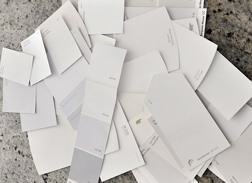
Exploring Shades for Painting Commercial Spaces
A well-painted workplace with pleasing colors can significantly boost employee morale. Also, carefully selected non-toxic, high-quality paints are important for your employees’ health and wellness.
The colors on your commercial walls can also influence customer behavior. For example, bright colors are known to grab attention whereas blues and whites help build trust and reliability in your product or service, making them an ideal choice for display walls.
Let’s look at how the shade of paint you use on your walls can impact your business.
- Evokes positive emotions: The right wall color can influence the mood and ambiance of your surroundings. Calming colors like blue and green are known to make you feel tranquil. Hues of yellow and orange, on the other hand, are perfect colors to uplift your mood and help create positive vibes.
- Increases productivity: Blue is known to help make you more focused, ideal for conference rooms and collaborative environments. Red, a bold color for an accent wall, can make you feel energized. If used together with a neutral shade of paint like white, grey or beige, it can add an active vibe to your surroundings.
- Improves brand image: A professionally painted office space with pleasing colors creates a positive first impression. Neutral colors, such as beige, ivory, and cream, convey professionalism. If done subtly and with creative finesse, using your brand’s logo colors on the walls can also boost brand recall.
- Influences perception of quality: Certain colors are associated with quality. While gold is associated with luxury and opulence, white and black are classy and elegant. An accent wall in any of these shades can influence a visitor’s or client’s perception of your company.
- Targets certain age demographic: Before painting your interior walls, consider your target audience. If your retail clothing store attracts younger clientele, vibrant colors are a great choice to reflect and complement their energy. On the other hand, muted shades are better if your expensive jewelry store caters to mature audiences, and you want them to focus entirely on your display cases.
Elevate Your Workplace with the Perfect Paint Color
Choosing the right shade of paint can have a transformative effect on your commercial space, turning it into a highly inspiring, productive, and functional environment. At Mastercraft Painting and Finishes, our team of expert commercial painters recognizes the significance of using high-quality paints to achieve professional results. With our expertise, you can create the workspace you desire, fostering productivity and success. Let us help you bring your vision to life.
Makeover your Philadelphia workspace with Mastercraft Painting and Finishes – your neighborhood GO-TO-GUYS in Montgomery & Bucks County, PA. Contact us at 267-496-5307 or online for a FREE estimate.